| Client: | Virginians Over-Taxed On Residences (VOTORS.org; archive here) |
| Category: | Complete media makeover for this nonprofit advocacy group |
Background
VOTORS (archive here) was founded in 2004 by Al Aitken, a pilot for American Airlines and retired Marine Corps fighter pilot. An activist by nature, Al’s biggest policy achievement at that time was his relentless work to pass national legislation allowing airline pilots to be armed in the cockpit, in the wake of the 9/11 attacks (he was successful).
In the following years, Al became aware that Virginians on low and fixed incomes, including seniors and many minorities, were being taxed out of their homes by constantly increasing property taxes. Al’s purpose in creating VOTORS was to advocate for a Virginia constitutional amendment that:
- Changes the Commonwealth’s “current market value” real estate property tax system to one that is based on “acquisition value.”
- Limits annual increases in property assessed values to a maximum of 1% plus any percentage increase in the rate of inflation, until the property is sold.
- Limits increases in local property tax rates to no more than 1% of the previous year’s tax rate.
As a low-tax advocate, upon learning of it, I became interested in VOTORS. Observing its logo and media materials, however, I felt they were severely sub-par, and expressed interest in consulting on and redesigning them.
There was one problem, though: VOTORS had no budget to hire me. I decided to do this work on a volunteer basis, and hopefully, with the funding that could be derived through the use of this new media, it could hire me to continue my work.
VOTORS and I agreed that the first priority was to redesign its logo. But as is described below, our work encompassed creating an entirely new suite of media tools for VOTORS.
First priority: A new logo for VOTORS
This is the logo that VOTORS was using at the time (see the old website here):
 I recommended several fundamental changes to the logo:
- As a significant portion of the Virginians who are hit the hardest by skyrocketing property taxes, and who are at risk of losing their homes because of it are minorities, a white militiaman with a rifle should not be used in the logo.
- The logo needs to be sleek, contemporary, instantly-recognizable, and be indicative of two key things: the right to vote, and a home.
- It should appeal to the two key audiences of VOTORS’ outreach: low- and fixed-income voters, and Virginia legislators.
Al felt these criticisms and recommendations were valid, and engaged me to embark on this redesign mission.
The new VOTORS logo
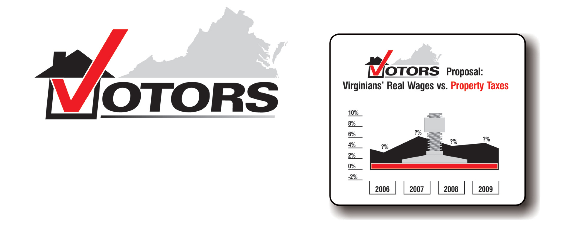
Several months of on-and-off work resulted in this logo. Aside from being visually striking, it integrates several distinct visual elements that together, convey an important message to both homeowners and elected politicians: the fact that Virginia homeowners have the power of the vote – and they can either support or reject political candidates and proposals:
As described in its letter of recommendation for me, VOTORS’ principals were so thrilled with its new logo that it enlisted my abilities in other areas of its outreach (described below):
“So impressed was I with our new logo that I asked Jon to use his abilities to help us improve our VOTORS brochure. Jon was able to take the message from our old version, add his own research on our grassroots cause, and turn our rather ordinary old brochure into one very logically laid out with eye-catching graphics, that not only attract a reader to our brochure, but also visually lead him or her to support VOTORS and our initiative.
“I presented Jon’s new VOTORS materials to my Board of Directors and a few other trusted colleagues. Their reaction can best be summed up in this quote from one of them: ‘I am – quite frankly – blown away by these materials. They look as if they came from a very expensive New York advertising agency. Truly impressive!’
“Our organization exists for the benefit of all taxpayers in Virginia, and Jon has become a welcome and essential element in our grassroots effort. I could not be more pleased with his work and our new relationship.”
– Al Aitken, VOTORS Founder & Chairman
Based on the success of the logo I designed, VOTORS asked me to perform two additional tasks:
- To rewrite and redesign the VOTORS brochure
- To research and develop a graphic that summarizes both the problem of out-of-control tax growth, and VOTORS’ proposed solution, in a way that is simple enough for the layperson to understand and retain. The piece would be integrated in the brochure, and act as a stand-alone presentation item on the website, etc.
Redevelopment of the VOTORS brochure
I identified several key problems with VOTORS’ existing brochure: the overall esthetics were poor; the copy was not sufficiently broken down into “bite-sized pieces”; and the only pictures were of white families
The old VOTORS brochure
Old VOTORS Brochure by jonsutz
.
My development of infographic economic charts
I worked with VOTORS and conducted additional research to develop the following graphic, per its request, to explain its basic proposal, and how it would benefit the taxpayer.
The chart on the left shows the dramatic difference between the annual percentage increase/decrease in Virginians’ real wages, versus the increase in their property taxes, over the past few years. In the chart on the right, I created an embellished “press,” to demonstrate that should VOTORS’ proposal be implemented, Virginians’ property taxes will never rise more than 1% per year again.

The new VOTORS brochure
Ultimately, I wanted the person opening the VOTORS brochure to instantaneously sense that it is designed to be read and understood – by anyone; that it is written in simple, plain language and that its contents were broken down logically and simply, to facilitate easy reading.
New VOTORS Brochure by jonsutz
.
.


